 I just fell a little deeper in love with Google Drive. I’m a numbers and visualization geek, and they just released new feature called SPARKLINE in Google Sheets that allows you to embed graphs right into cells. They didn’t do this halfway, either – there are all sorts of customization options. Here I’m going to show you the types of graphs offered and how to use the SPARKLINE function using the bar graph, and then explain briefly about the other types. I’ll also link to the specs on Google’s site so you can dig deeper if you want to.
Step 1. Set up the data you want to chart.
You probably already have this data in some sheet somewhere, but if not you can easily create it. If you want to follow along, here’s the data I’m using:
| January | February | March | April | May | June | July |
| $112,000 | -$50,000 | -$20,000 | $140,000 | $95,000 | $98,000 | $34,000 |
You can copy and paste into Sheets from the table above.
Step 2. Enter the basic Drive SPARKLINE formula
Fortunately Google has made creating a basic SPARKLINE super simple:
- Choose the cell you want the graph to appear in. I like making it in line with the data.
- Type in the following: =SPARKLINE(
- Use your mouse to select the fields you want to graph, or type them in. On my sheet that would be A2:G2
- Close the parenthesis so it looks like this: =SPARKLINE(A2:G2)
- Hit enter
You should get something like this:
Notice I made my row height a little higher so the changes are more pronounced.
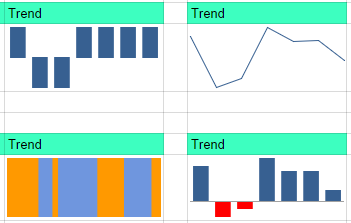
Step 3. Choose Your Chart Type
To choose the type, you need to add another term after the data range. Here is each type of chart with the term to add and visuals using our data:
Line Graph
This is the default shown above. You already know how to do this, but there are more options to customize by setting your maximum and minimum range for height or width of the graph, and the color of the line. Link to all the options and code required is at the bottom of the post.
Bar Graph
This is a stacked bar graph, so the width of colors relates to absolute values of our data (negatives and positives don’t apply) and it alternates color for every data point. In our example:
=SPARKLINE(A2:G2, {“charttype”, “bar”})
For these you can also customize: maximum value along horizontal axis, the colors used, and whether the graph goes from right to left or left to right. (Instructions below on implementing these)
Column Graph
This is your standard column graph with the height of each corresponding to the data point values.
=SPARKLINE(A2:G2, {“charttype”, “column”})
In column graphs you can customize the main color, color of the lowest and highest values (separately), color of the first and last columns (separately), color of negative elements, whether or not you show an axis, color of the axis, and max and min for the height.
Win/Loss Graph
This is an interesting one – just shows an up column for positive and a down column for negative.
=SPARKLINE(A2:G2, {“charttype”, “winloss”})
Customization options for win/loss graphs are the same as column graphs.
Customization
Setting all those extra values is pretty straightforward, you just have to make sure you type in everything exactly right. Adding additional values is the same as telling Sheets what chart type you want – you tell it the type of variable you’re setting, then the value. So, if I wanted to set the color of negative values for my column graph, I would say:
=SPARKLINE(A2:G2, {“charttype”, “column”; “negcolor”, “red”})
Some values, like true/false or numbers, shouldn’t have quotes. So for adding an axis I would type this:
=SPARKLINE(A2:G2, {“charttype”, “column”; “negcolor”, “red”; “axis”, true})
For all of the variables and everything else you need to go crazy with SPARKLINE, visit Google’s description of the function.
One Last Trick
I just figured this one out as I was writing the article. It’s one that might not be used a lot, but in certain cases it could save you a ton of time. Here it is: You don’t have to type in the chart type – or any variable, right into the function. Just like anything in Sheets, you can reference another cell. So if I set up my chart like this:
=SPARKLINE(A2:G2, {I9, “column”; “negcolor”, “red”; “axis”, true})
I can just use the cell I9 to type in whatever chart type and Sheets will change it just like that. And I can do this for any variable.
If you have any questions, or good use cases, let everyone know in the comments.